When a man like Elon Musk tells you that you won’t have to work anymore because Artificial Intelligence will make mundane tasks redundant, it tells you more about the man himself and the rarified atmosphere of the world he inhabits. Someone who knows more about computers than the realm of real people. Someone who has made much of his considerable fortune buying into other people’s talent and skills rather than having to do the work himself. Which is probably why he is able to dispose of a workforce like those who used to manage Twitter so easily. Probably never crossed his mind there might be one or two people he would need some time.
Certainly AI is intended and expected to replace repetitive tasks that don’t need continual human supervision, as well as tackle more difficult tasks much faster and more precisely. But my experience of life is that there is nothing so simple that it can’t be cocked up, or SNAFU as it used to be called in military slang.
If you are anything like me your first reaction was probably not to order lots of holiday brochures and a set of golf clubs. My immediate reaction was : someone’s going to have to switch the computer on in the first place, and pull the plug when it all goes wrong ( “...You don’t want to do that, Dave “says the threatening electronic voice of Hal 9000 in Kubrick’s 2001). Anyone who has faith in computers fixing themselves has obviously never used Windows Troubleshooter which invariably tells you, after lengthy consideration, that whatever is wrong it can’t fix it.
Anyone who works with the technology on a regular basis has a healthy disrespect for the term ‘computer design’ which used to be such a buzz phrase when it was all so novel and exciting a few decades ago. It used to be a unique sales pitch, now it’s a note of caution. When you get to a certain age, scepticism is a default mode. You’ve heard all the promises and predictions before - like all the leisure time this coming revolution was going to give you. I’m still waiting to enjoy that.
Of course I spend a large part of my day on a computer, so my cynicism is matched with an equal amount of respect for what they can do. But knowing what they can do also means knowing what they can’t do, and that is the dilemma at the heart of the debate on the future of AI. So much of the speculation is just that - people with limited vision staring into the vast reaches of space, trying to make some sense of the universe. Most of them can only see in one direction - either the black hole or the milky way. Somewhere in between is the answer but we won’t know till we get there.
Unfortunately AI can only predict what will be based on what has been, and what exists in the present however vast its resources.
Interestingly, while there is a prediction that it will eventually run out of images from which to sample, it appears that some of the generative text apps are struggling in some languages other than English because of the disproportionate amount of it as the almost universal language of the web.
Adobe only uses their own resource of stock images, which is still extensive, and well catalogued. But generating entirely new pictures, while it may be eye catching, doesn’t really concern us in the workplace. The more practical uses of AI do, as there are a number of ways it can help with issues that come up daily dealing with customers files for print.
 |
One of the most common problems is that they arrive the wrong size and shape for the requested output, whether just needing additional bleed, or being completely the wrong proportions to fit the page. Until Content Aware appeared some years ago, anything that couldn’t be solved by just filling the additional space with solid colour meant carefully, manually, trying to make up the void with cloning and patching. Content Aware gave you an intelligent assistant to help the selection. But it wasn’t always convincing, even with a certain amount of human control, because it could only recycle what was in the original, not up with anything new but visually compatible.
That’s where the AI comes in, not the generative fill prompt that grabs all the attention, but generative expand which does a more mundane but much more practical job as far as our routine is concerned.
I used some examples last month as well as mentioning the Point Colour picker which had only just been introduced into Photoshop, but having had more time with both tools I thought I’d cover some more useful examples typical of the types of image adjustment needed on a regular basis. As ever there are always several ways of doing things in PS, and this is intentional as almost every image is unique to one extent or another. There is no one fix all as a result, just one slightly better than the other. But that’s where the human bit comes in - or should. Remember the machine doesn’t care whether it looks realistic or not because it doesn’t know what real is: much less care.
As long as it completes its task that’s enough!
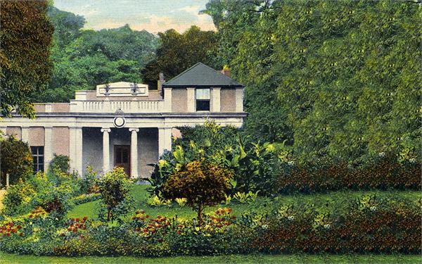
So we have this old image of a building in a park, but it’s square and the customer wants a landscape postcard. No problem. Previously you would have had to say no, but you could do it portrait with Content Aware and a bit of cloning because you have grass and you have some sky and it was easier to replace them. However Gen Expand is a game changer as you can see. If we use Content Aware it just does a step repeat which doesn’t look very good. Gen Ex however creates a whole new growth of foliage, blended in from the original, but entirely new, just as nature would have intended. At the moment the pixels generated tend to be of lower resolution just because of the computing power needed so the magic may not be quite ready for large prints yet. But it will get there.
Back in the day you wouldn’t have even bothered to try - just said no, you’ll have to have it square. Nowadays the answer to can you do something on the computer, is probably, yes! Customers aren’t so easily fobbed off these days, they’ve been sold so many amazing fantasies on their phones. One of those tricks is changing the colour of things, like a dress to see if it will match a handbag or vice versa. Looks fine on the small screen but won’t translate into proper print.
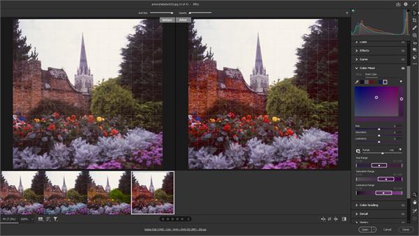
We’ve always been able to change the colour of things in Photoshop, but how precisely you could do that depended on the difference between one pixel and another. Now with the help of our electronic friend we can be more precise, both in the selection of colours, and all of the hues and other adjustments you can do to them.
 |
The Point Colour only pops up in the latest version of Photoshop Camera Raw, and this may be a problem if your computer cannot run it because of Graphic Card issues like most older models. But a cheaper alternative to buying a new computer is to use the identical tool in Lightroom. You should have it in the Adobe package, and it’s not as memory hungry in action. It may look a little confusing at first as you import a version of the file rather than open it, and affect the changes you want to make and apply them later rather than doing it in real time. This is both non-destructive to the original, and means the whole process runs faster and can be applied to multiple images rather than the more cumbersome method of individual files in Photoshop.
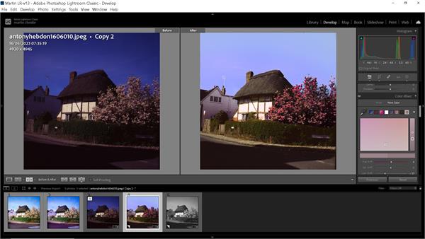 |
Lightroom was introduced quite a few years ago to suit photographers generally dealing with lots of similar images, which is why it’s less used in print on demand where generally only one or two are to be fixed. It has gradually become more powerful, doing many of the things you can do in PS, and some of them better. So if you haven’t used it before, it’s well worthwhile having a dabble. As usual, there are plenty of useful tips for the beginner on line if you need any help. Getting started.
As you can see the two workspaces are very similar in use. The colour sampler can store up to eight different swatches from an image so you can dip into any of those, including the range of sampling as well the Hue, Saturation and Luminance. A more basic version was, and still is, in the Colour Mixer panel, but this addition is more precise and user friendly in operation. You can see with either option how easy it is to completely change individual colours without affecting those around, as well as change any of them to balance the overall image.
I’ve used some more extreme examples to be obvious in print or on the screen, but you can be much more subtle, and I’ve used this function, and the previous, to make those tiny tweaks to fine art and photographic printing that make all the difference in the final product.
So often in the past I would spend time getting the grass the right shade of green for example, only to discover the blue in the sky had a tad too much green in it. Painters have the advantage that they can just slap another layer of eggshell blue over it. We don’t have that luxury in print, but at least now AI is giving us a helping hand.
When you are up against customers who only have a phone screen as colour reference it’s good to have as much help as possible to second guess what they expect to come out of the other end of the printer. After all you are the one who should know, not them. Happy editing!